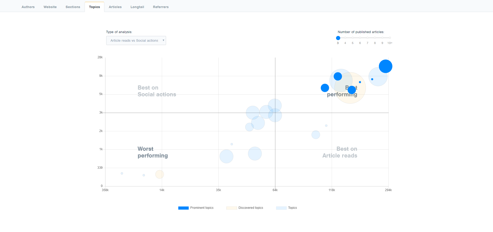
In the bubble chart, the position of the bubble in the chart determines the performance of the topic, based on selected metrics on the axis.
The size of the bubble is communicating the number of articles covering the topic.
The colour of the bubble is communicating if the topic was sent via tracking code (blue colour) or picked up by our Automatic Topic Extraction Engine (orange colour).
However, given that the number of topics is usually huge there is one more mechanism to highlight topics which should get the most attention from the editor. Those topics are the ones that were particularly good or particularly bad at performance and they are represented by the circles with full colour. Other topics are displayed by semi-transparent circles and the variation
in their colour comes from overlapping of the circles in the graph.
To determine which topics should be represented in full colour, we look for the topics with the best and the worst ratio of the number of articles and base metrics. The metrics used are article reads, social actions and attention time. The best topics managed to get significantly above the average values for metrics despite having significantly below the average number of
articles. The worst ones are just the opposite - significantly higher number of articles, but with significantly lower performance in the terms of metrics.

